The app created to make the most of your time
Just in Time is a mobile app designed to help busy workers save precious time during their lunch break. The concept emerged from a simple insight: for people who only have 45–60 minutes to eat, the traditional restaurant experience becomes stressful and inefficient, waiting to be seated, reading the menu, ordering, and then waiting again for the food to be prepared.
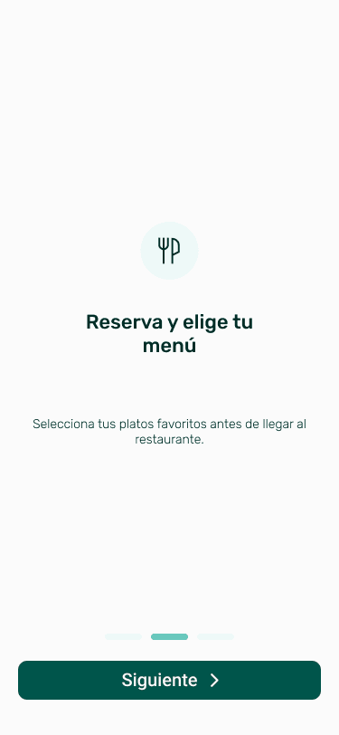
The app solves this by allowing users to reserve a time slot, pre‑select their menu, and pay in advance. When they arrive, their meal is already prepared. No queues, no decisions under pressure, and no delays. Just an optimized, predictable, and frictionless lunch experience.
As the end‑to‑end Product Designer, I led the full process from problem validation to prototyping and testing. I explored the motivations of time‑constrained users, analyzed the operational constraints of restaurants, and designed a seamless experience that balanced user convenience with realistic restaurant workflows. This case study walks through how I uncovered the problem, shaped the solution, and refined it through iteration to create a product that delivers real, tangible time savings.
ROLE & DURATION
Product Designer: Product Thinking, Interaction, Visual design & Prototyping
2023

OVERVIEW
Just In Time is an app created to make the most of your time. You can make a reservation at a restaurant by choosing the menu beforehand, so it’s arrive and eat.
It’s designed to avoid wasting time choosing the food or waiting for it to be served.
INSIGHTS
The objective of this project was:
· Be the main driver of restaurant bookings
· Be present in different cities
· The platform that gives the hospitality sector a boost in terms of digitalisation

FIND THE PROBLEM, EXPLORE SOLUTIONS
We had 4 points to cover:
· Stand out from the competition
· Resolve the menu’s selection
· The interaction between the app and the restaurants
· The interaction between the app and the users
INVESTIGATION
An online questionnaire was administered to a random sample of 100 people with the aim of gaining a deeper understanding of the target audience and their consumption habits.
50% eat out 1 to 2 days a week during the working day, the 88% says that they eat lunch or dinner out once or twice a week and the 78% have ever used table reservation or delivery platforms or applications.
Respondents give a restaurant's speed and punctuality a score of 7.96 points.
100
Forms
78%
Use reservation platforms
13
Interviews
ARCHETYPE
From those interviews came Laia, our archetype. Laia is 27 years old, she works in a multinational company and she likes to try a wide variety of food.

LAIA, 27
“Time has become one of the most valuable treasures we have.
We live at a frenetic pace and have a personal and work schedule that generally limits our breaks and free time, including meal breaks. Inevitably, waiting is part of our daily lives.”
They say we spend four years of our lives in a queue, and that six minutes is our waiting limit before we decide to leave it. In any case, we all know how important it is to take the time to eat and to enjoy.
Every day we face the same problem: limited meal times of about 60 minutes and little flexibility.
INSIGHTS
Taking that point of frustration.
We decided to make a dump of the insights of the problems that had come out in the interviews we had carried out, and we realized that the great point was to improve the restaurant/client service to better manage time, so the people can have more free time to spend it whatever they want.
WIREFRAMES, PROTOTYPING & TESTS
We created some wireframes helping us to start with the guerrilla testing to validate the functionalities and detect some issues with the interactions.
After these testings we iterated the wireframes and added some colors and text style.


20 user tests were done. 2 types of tests: depth and guerrilla. In addition, we had to do several remotely. They took a total of 11 hours and 4 iterations. These have helped us a lot to identify the problems that the user had when they faced the different tasks that we were asking them throughout the test.
20
User tests
11
Hours
4
Iterations

STYLE GUIDE
Colours:
We decided to use this colours to represent the nature but with a warm touch and contrast.
PRIMARY
SECUNDARY
NEUTRE
Typography:
Rubik
abcdefghijklmnñopqrstuvwxyz
abcdefghijklmnñopqrstuvwxyz
AG
ag
RUBIK
RUBIK
RUBIK
🖥
Major Third
1.25
Base Size
22px
📱
Major Third
1.25
Base Size
20px
We used the Rubik typography because it has personality, presence and two differents types, symmetric and asymmetric.
The symmetric is perfect for the titles and the asymmetric for the body
SOLUTION
Testing the prototype a lot
Adding new functionallities iteratively incremental
Improve the menu selection
Creating new interactions to involve the user



CONCLUSION
Just in Time was my first end-to-end product experience, and it shaped how I approach design today. Building from zero taught me that the quality of the research directly determines the quality of the solution. Every design decision we made was traceable back to a real user insight, and that discipline has stayed with me ever since.
It also reinforced that launching a product is a team sport. Balancing user needs with restaurant operational constraints required constant negotiation and compromise, skills that have proved essential in every project since.