ICF Web Redesign — The public development bank of the Government of Catalonia
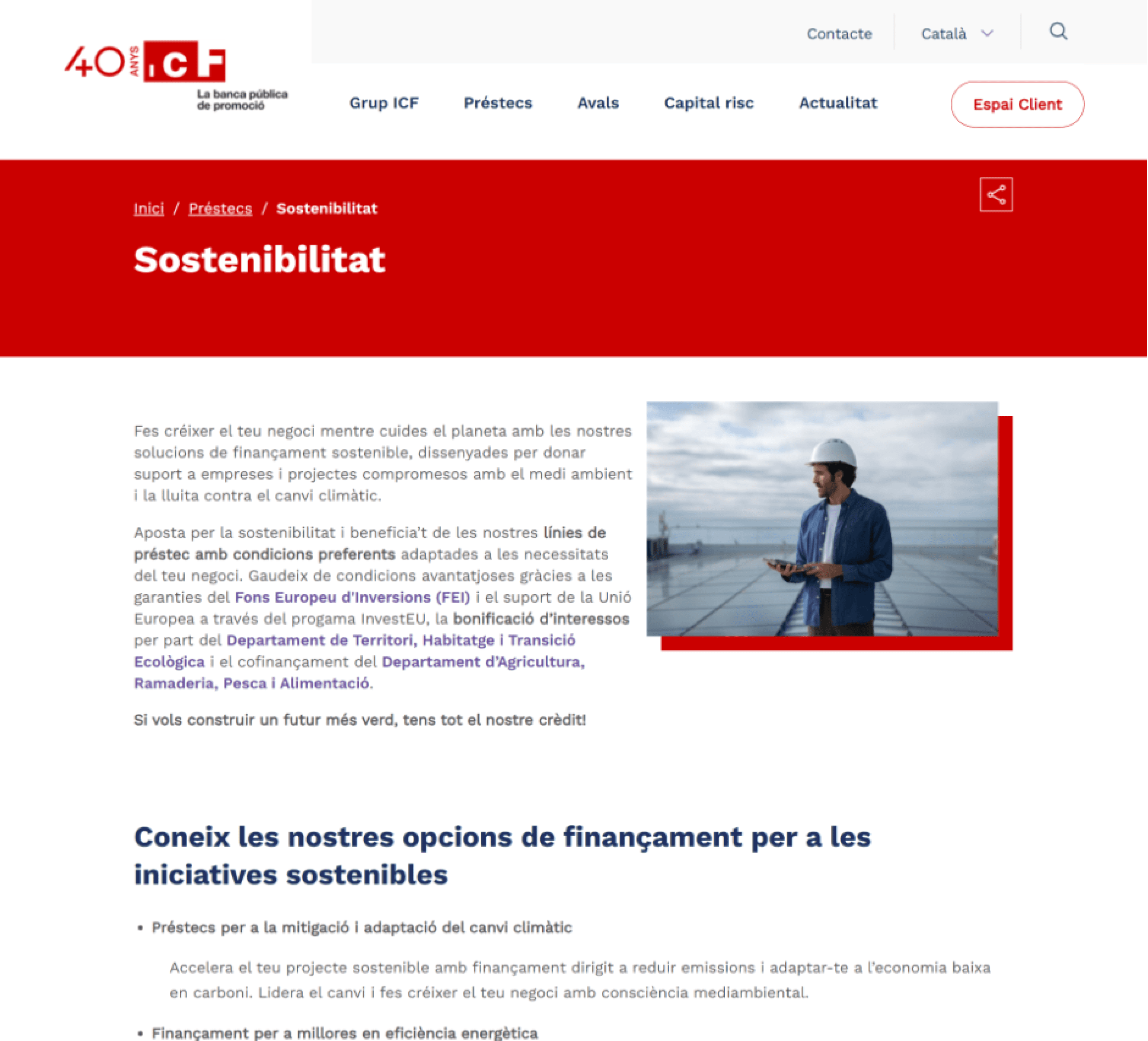
The Institut Català de Finances (ICF) provides financing services for companies and individuals across Catalonia. By early 2025, their digital application process had become outdated: long forms, unclear validation, inconsistent patterns, and accessibility gaps made the experience difficult both for new applicants and returning users.
The challenge wasn’t superficial—it was structural and regulatory. Financial data requires precision, legal compliance, and strong alignment between design, engineering, and security teams. Multi‑step flows were failing in key areas: users didn’t understand what was required, errors weren’t clear, and many dropped out mid‑process.
As the Product Designer, my responsibility was to bring order and clarity to a process full of friction. My role spanned research, UX strategy, flow restructuring, prototyping, design system work, and close collaboration with stakeholders and engineering to ensure every state worked in the real world, not just in Figma.
ROLE & DURATION
Product Designer: Product Thinking, Architecture, Interaction, Visual design & Prototyping
2025

PROCESS
The transformation followed a structured process:
Discovery: We audited the existing application flow, identified friction points, and gathered feedback through surveys, interviews, and stakeholder workshops.
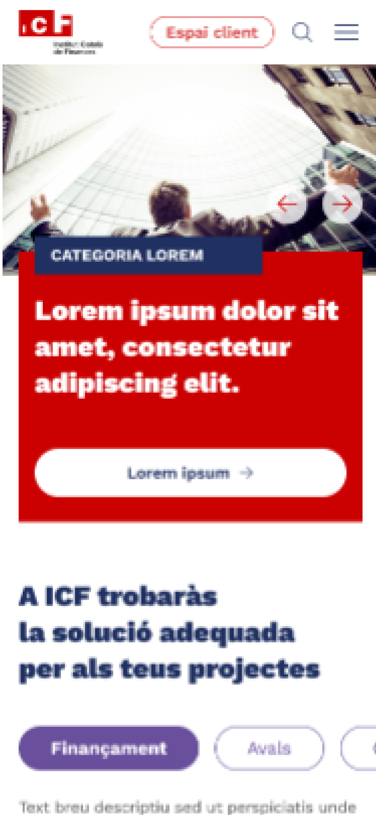
Definition: We rebuilt the user journeys, breaking complex requirements into digestible steps and restructuring the multi‑step application around progressive disclosure.
Design: We created wireframes and high‑fidelity prototypes focusing on clarity, inline validation, accessible error states, and guidance for each step.
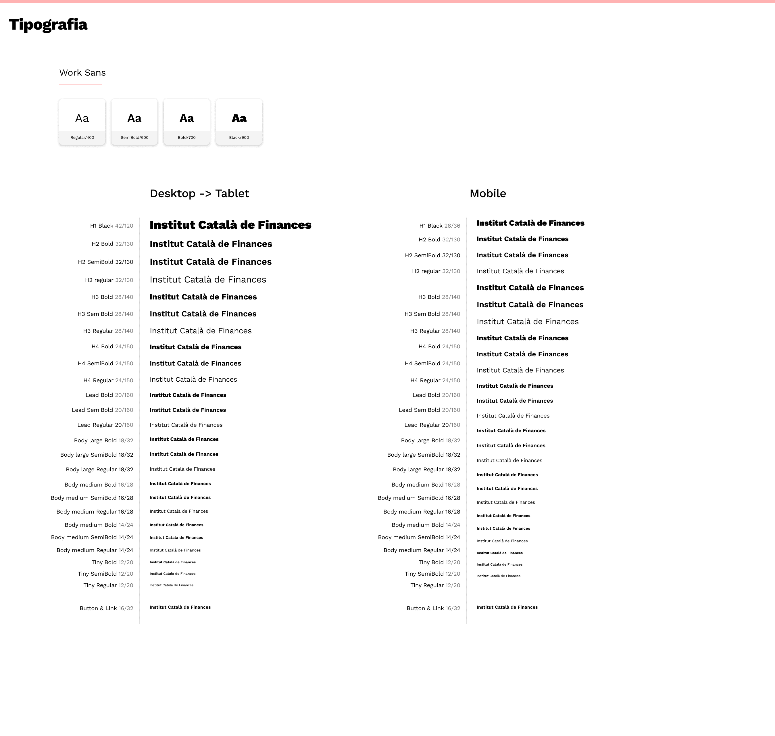
Design System: We developed a set of reusable form components (inputs, dropdowns, validation states) with tokens for spacing, color, and typography to ensure visual consistency.
Accessibility: WCAG 2.2 principles guided element structure, keyboard navigation, ARIA labels, and error-message semantics.
INVESTIGATION
Before proposing changes, we needed to understand how users experienced the financial application journey. We launched surveys targeting individuals and SMEs to gather quantitative insights about friction points such as confusing form fields, unclear requirements, and difficulty resuming applications.
Then, we conducted interviews with a representative set of applicants and internal stakeholders. These sessions revealed patterns: users often felt overwhelmed by the volume of information requested, validation messages were cryptic, and many abandoned the process after encountering repeated errors.
To connect the dots, we created multiple Customer Journey Maps, each focused on a different user profile. These maps exposed emotional peaks and pain points frustration during verification steps, uncertainty about documentation, and confusion at decision‑making stages.
This research became the foundation for the redesign, guiding our decisions and ensuring every improvement responded to real user needs rather than assumptions.
25
Forms
8
Interviews
30%
Had difficulties to find what they were searching
KEY DECISIONS
Throughout the project, we made several strategic decisions to improve clarity, reduce errors, and increase completion rates:
Split long forms into logical multi‑step sections so users could focus on one requirement at a time.
Implement progressive disclosure, showing only relevant fields based on user selections or financial criteria.
Introduce inline validation to prevent confusion and reduce submission failures.
Create “save and resume” functionality for users who needed more time or additional documentation.
Standardize form components through a dedicated design system to ensure consistency across the application process.
Document error, empty, and loading states so engineering and QA could handle all scenarios reliably.
These decisions weren’t cosmetic—they fundamentally changed how users interacted with the financial application process.


A lot of meetings with the stakeholders, from all departments. Everyone had their needs so we had to listen to everyone to fit everything
WIREFRAMES, PROTOTYPING & TESTS
Transforming these insights into structure required deep alignment with stakeholders. Over the course of the project, we held more than 50 meetings with the client, legal teams, engineering, security, and QA. Each conversation revealed new constraints, exceptions, or validation rules that impacted the flow.
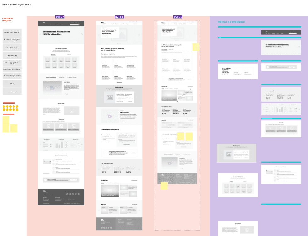
Wireframing became a highly iterative process. Early drafts were challenged, refined, or rebuilt entirely as we uncovered edge cases and regulatory requirements. Multi‑step forms were simplified, grouped into logical sections, and connected through clearer progress indicators. Inline validation and contextual help were introduced to reduce user anxiety and prevent premature errors.
After dozens of iterations, the wireframes became a precise blueprint that balanced user clarity with financial regulation. The structure we built during this phase became the backbone of the entire redesign, functional, compliant, and scalable.
+50
Stakeholders meetings
8
Hours
8
Iterations


OUTCOME
The redesigned portal delivered substantial improvements in clarity, consistency, and accessibility. Users were now able to progress through complex forms with fewer errors and clearer guidance. Inline validation and improved messaging reduced frustration, while modular components increased scalability for future services.
Engineering benefited from clearer specifications, reducing back‑and‑forth conversations and implementation inconsistencies. QA cycles were faster thanks to the detailed documentation of states and edge cases.
Overall, we improved task completion by 20%, the new design created a more stable, more understandable, and more compliant experience for applicants and internal teams alike.




LEARNINGS
This project highlighted how essential it is to design not only for the ideal user path but also for all the messy, real world scenarios, especially in financial contexts. Regulatory constraints can feel limiting, but when integrated early, they provide structure rather than barriers.
We also learned the importance of deep collaboration: constant communication with legal, engineering, and QA avoided costly redesigns and eliminated ambiguity. The iterative process reinforced that clarity comes from co-creation, not isolation.
Finally, building a scalable design system showed us that consistency is not a luxury, it’s a prerequisite for long‑term maintainability. Investing in tokens, components, and documentation paid off across the entire product lifecycle.