
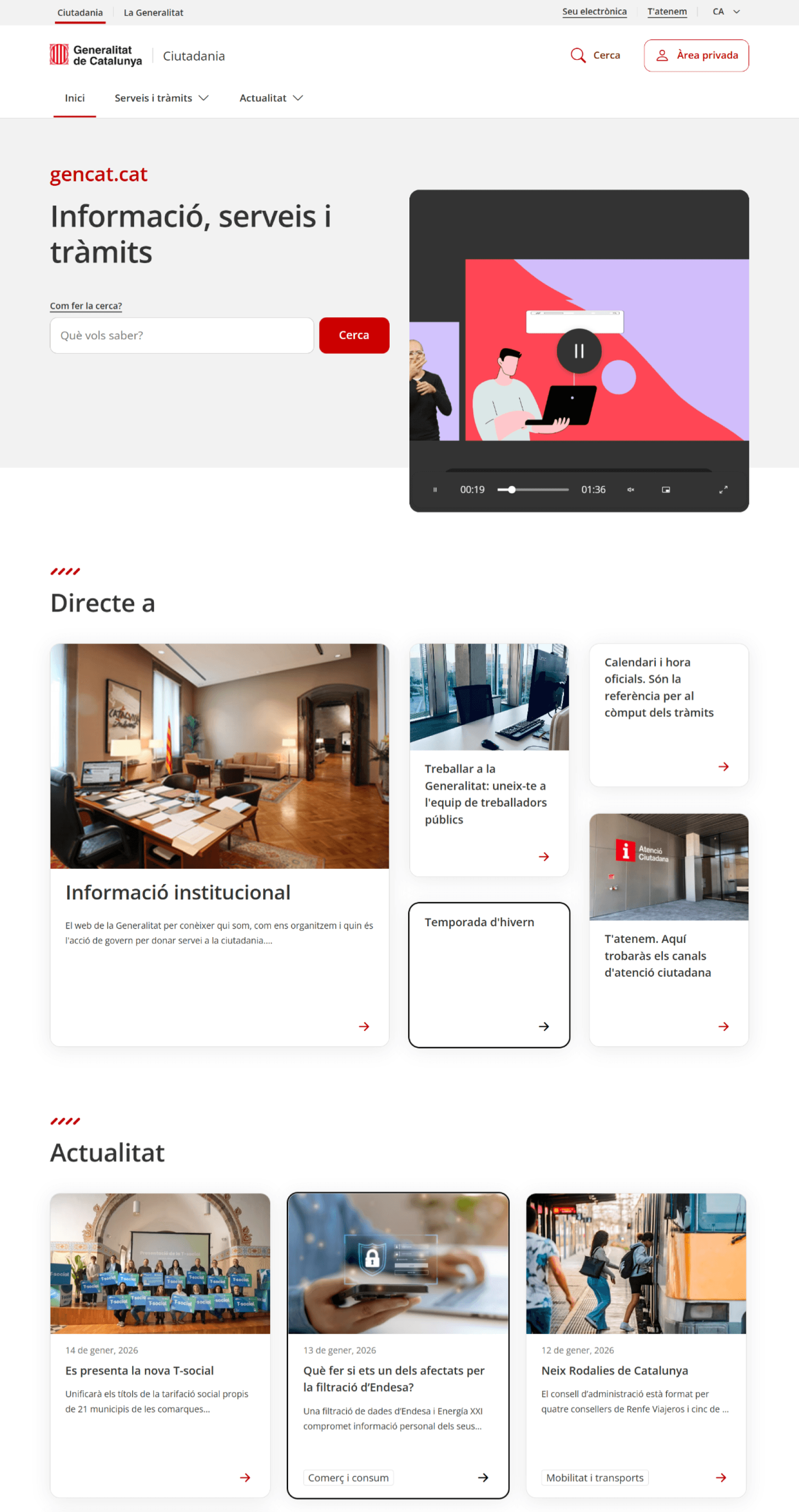
It was early 2024. The Generalitat de Catalunya managed a vast digital ecosystem serving millions of citizens, but the experience was fragmented. Navigation was inconsistent, accessibility standards were lagging, and users struggled to find essential services quickly.
The challenge wasn’t just visual, it was structural.
Multiple departments published content independently, creating a maze of pages and patterns. Legal and accessibility requirements added complexity, and deadlines were tight due to upcoming public campaigns.
As the Product Designer, my mission was clear: bring clarity and consistency to this ecosystem. That meant redefining information architecture, creating a scalable design system, and ensuring compliance with WCAG 2.2, all while balancing stakeholder needs and technical constraints.
I’m proud of what we achieved: a unified experience that improved usability, met accessibility standards, and laid the foundation for future scalability.
ROLE & DURATION
Product Designer: Product Thinking, Architecture, Interaction, Visual design & Prototyping
2024 - WIP
CONSTRAINTS
Institutional guidelines and legal requirements
Legacy patterns and technical debt
Tight deadlines due to public campaigns
Content generated by multiple departments
FIND THE PROBLEM, EXPLORE SOLUTIONS
We started with a deep audit of the existing ecosystem. Navigation was inconsistent, content scattered, and accessibility gaps everywhere.
The first step was Discovery: mapping pain points, reviewing analytics, and interviewing stakeholders to understand priorities.
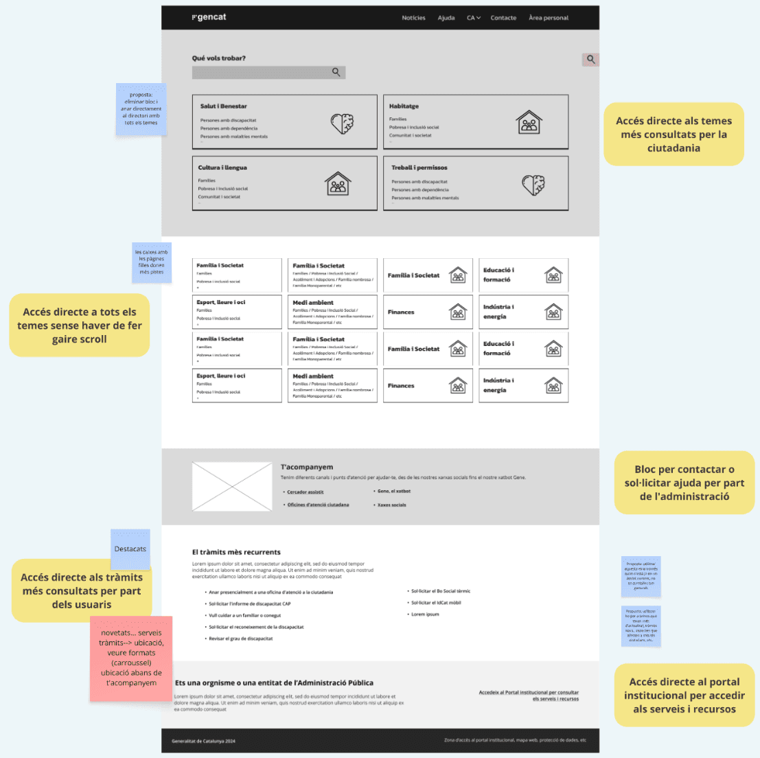
Then came Definition: we proposed a new information architecture and navigation principles that could scale across multiple departments.
Finally, Design: wireframes evolved into high-fidelity prototypes, supported by a robust design system with tokens and reusable components. Accessibility wasn’t an afterthought it was baked in from day one compliance guiding every decision.


PROCESS
Discovery: Heuristic audit, analytics review, content inventory, navigation mapping
Definition: Proposed IA (sitemap), navigation principles, labeling rules
Design: Wireframes → hi-fi prototypes, reusable components with states
Design System: Tokens (color, typography, spacing), components (header, navigation, cards, news modules, search, pagination)
Accessibility: Contrast, focus order, ARIA roles, touch targets, error messages
Validation: Figma prototype walkthroughs with stakeholders
Delivery: Specs in Figma + acceptance criteria in Jira; QA support for functional and accessibility tests
INVESTIGATION
Before jumping into design, we needed to understand the real pain points.
We started with surveys to capture quantitative feedback from frequent users and identify the most common frustrations.
Then, we conducted in-depth interviews with different user profiles individuals, SMEs, and internal stakeholders to uncover hidden needs and expectations.
From these conversations, we extracted key insights: users struggled with navigation, form complexity, and lack of clarity in error messages.
To visualize these findings, we created several Customer Journey Maps, highlighting moments of friction and opportunities for improvement across the entire application process.
This research became the foundation for every design decision, ensuring that our solutions were not just aesthetic but truly user-centered.
KEY DECISIONS
Every choice we made was driven by clarity and compliance.
Unify navigation patterns across all services to reduce cognitive load and make the experience predictable.
Create a modular design system with tokens and reusable components to ensure consistency and accelerate future updates.
Integrate accessibility standards from day one, avoiding costly fixes later and guaranteeing WCAG 2.2 compliance.
Document edge cases and states (empty, error, loading) so engineering and QA could work without ambiguity.


A lot of meetings with the stakeholders, from all departments. Everyone had their needs so we had to listen to everyone to fit everything
WIREFRAMES, PROTOTYPING & TESTS
Turning research insights into structure required an enormous amount of collaboration.
Over several months, we held more than 100 meetings with the client, aligning expectations, reviewing flows, and refining every detail of the user journey. Each session brought new perspectives, new constraints, and new edge cases we hadn’t considered before.
The wireframing phase became a living, evolving process—a space where ideas were tested, challenged, and reshaped continuously. We translated complex financial rules, legal requirements, and multi‑user scenarios into clear, navigable layouts. Dozens of iterations later, the wireframes grew into a solid blueprint that balanced user needs with regulatory demands.
It wasn’t just about producing screens—it was about building clarity where there was none, reducing friction in long multi‑step flows, and creating a structure that engineering, QA, and stakeholders could agree on.
This phase alone represented countless working hours, but it laid the foundation for a design that was not only functional but resilient, scalable, and aligned with the real-world needs of the people using the system.
+100
Stakeholders meetings
8
Hours
8
Iterations


The redesign delivered a consistent, accessible ecosystem that improved usability and reduced friction for millions of users.
Departments now share a common design language, making content easier to maintain.
QA cycles became faster thanks to clear documentation and component specs.
Most importantly, Reduced time on task flows by streamlining navigation and information architecture by 15%. Citizens can find what they need without getting lost in a maze of pages and call center calls were reduced by 20%.


This project was a reminder that designing for the public sector is as much about people and processes as it is about interfaces.
One of the biggest lessons was the importance of early and continuous alignment. With so many stakeholders involved legal teams, business owners, technical leads, and content creators clarity had to be built, not assumed. Establishing shared understanding from the beginning saved countless hours down the line.
Another key learning was that accessibility becomes far more manageable when treated as a foundation instead of an add‑on. By integrating WCAG principles into the earliest wireframes and components, we avoided costly rework and ensured that every iteration moved us closer to an inclusive experience.
Through more than 100 meetings and dozens of iterations, I also learned the value of embracing complexity without letting it dictate the design. Breaking down multi‑step flows, untangling legacy requirements, and structuring information in a meaningful way required patience, negotiation, and a willingness to evolve ideas rather than defend them.
Finally, working hand‑in‑hand with QA reinforced how essential it is to design not only for ideal states but for all the messy, real‑world edge cases. Documenting errors, empty states, and system quirks improved cross‑team communication and made the final product more resilient.
This project reaffirmed that great design emerges from collaboration, persistence, and a deep respect for the people who will rely on the product every day.
